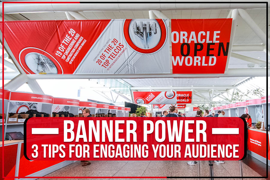
Very few things are as effective as a well-made banner when getting your message out. Banners can be used to engage an audience in several ways, from informing them about a new product or service to motivating them to take action.
Look no further if you’re looking for ways to create powerful banners that will grab your audience’s attention! Big Daddy’s Signs will discuss three tips for engaging your audience with banners in this blog post.
Keep scrolling to learn more!
No. 1: Design for Distance
When designing your banner, it’s essential to remember that people will often be viewing it from a distance. You’ll need to make your text and images large and easy to read.
One way to execute this is to use a sans serif font, which doesn’t have small decorative lines at the tail of each letter. This makes it simpler for people to read from a distance.
You should also avoid flooding too much text on your banner. Try to keep your message sweet and straightforward. Use bullet points or short phrases instead of long paragraphs.
And finally, make sure that your images are high-quality and easily visible. Blurry or low-resolution photos will be much harder to see from a distance.
No. 2: Scalable Secrets
The key to spreading your message far and wide is to make sure you use your banners in different sizes, customized for different locations. For example, you might want a large banner to hang in your storefront window and smaller ones to post around town.
Creating a banner template that can be easily scaled to different sizes will spare you time and headaches in the long run. Your banners can also cater to online and offline audiences. You can post a digital version of your banner on social media or print copies to hand out to people on the street.
No. 3: Nuance of Negative Space
Negative space includes the area around and between the subjects of an image. It’s important to consider negative space when creating banners, as you can harness it to create balance, contrast, and visual interest.
When designing a banner, think about how you can use negative space to your advantage. For example, you might want to use a light background to make a dark-colored subject pop. Or, you might want to use a busy background to make a simple subject stand out.
No matter what your approach, remember that the negative space on your banner is just as important as the positive space!
Conclusion
There are multiple factors to consider when creating an engaging banner. However, by following these three tips, you’ll be on your way to designing a banner that will grab attention and convey your message.
If you need help bringing your vision to life, Big Daddy’s Signs is here to help! We offer reliable service and high-quality signs in Buffalo, NY, sure to convey your message.


