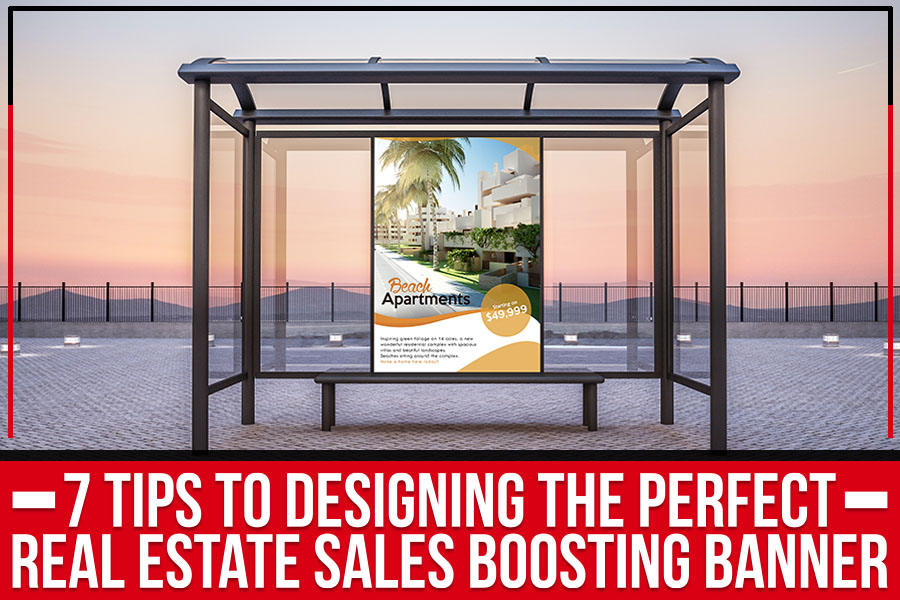
When it comes to real estate, there’s no room for second best. That’s why you need an eye-catching real estate banner that will draw in buyers and sellers from all across town. With just a few simple tips, you can create the perfect banner to have everyone talking about your business.
1) Keep it Minimal
When it comes to real estate banners, less is more. Too much information will only overwhelm potential customers and drive them away. Stick to the basics – your company logo, contact information, and a brief message.
2) Use Eye-Catching Colors
Real estate is about making a first impression, so ensure your banner does just that. Bright colors are always eye-catching, so consider using a combination of two or three complementary hues. Just be careful not to go overboard – you don’t want your banner to be too loud or flashy.
3) Choose the Right Fonts
Bystanders should easily read the fonts on your real estate banner from a distance. Stick with simple sans serif font in a large size – this will make your message clear and easy to understand.
4) Include a Call-to-Action
Your real estate banner should have a clear call-to-action telling potential customers what you want them to do. Whether “call us for more information” or “visit our website,” make sure your CTA is short, sweet, and to the point.
5) An Engaging Caption
When deciding on the right slogan for your real estate banner, there’s a lot to play with. Use that as your focal point if you’re selling a particular property. If you’re trying to increase brand awareness, go with something short and snappy that will catch readers’ attention.
6) Use High-Quality Images
The images on your real estate banner should be high-quality and professionally taken. After all, you’re trying to sell a luxurious product – your banner should reflect that.
7) Balance White Space
Make sure your real estate banner has enough white space to avoid looking cluttered. A good rule of thumb is to keep about 60% of your banner as white space. This will help make the rest of your design elements pop.
Avoid the Following
Don’t Use All Caps
Using all caps in your real estate banner design will make it difficult for readers to process the information. It also comes across as shouty and can be off-putting to potential buyers.
Don’t Include Too Much Text.
As we mentioned, real estate banners are meant to be eye-catching and easy to digest. Including too much text will make your banner look cluttered and overwhelming. Stick to short, catchy phrases that pack a punch.
Don’t Use Clip Art
Clip art is cheap and tacky looking. If you want your real estate banner to look professional, steer clear of clip art altogether.
If you want the perfect real estate sales boosting banner, look no further than Big Daddy’s Signs serving Atlanta, GA. Our experts can help you create a catchy and creative banner that will help drive traffic and sales to your real estate business.


