There is a science to printing signs, especially when the intent is to promote a business, a venture, a startup, or when propagating a marketing campaign. A well-executed sign can grab attention and convey the message you need it to. However, if you don’t know the dos and don’ts of printing signs, you could wind up with an eyesore rather than an effective marketing tool.
Are you looking to print some new signage for your business? Read the following dos and don’ts of printing signs to make sure the finished product looks great!
The Dos of Sign Printing –
Use High-Quality Materials
If you’re looking for a sign that grabs attention and holds up over time, you need to use high-quality materials. This means investing in thicker paper or cardstock and printing on one side only. You should also avoid using glossy materials, as they can be challenging to read.
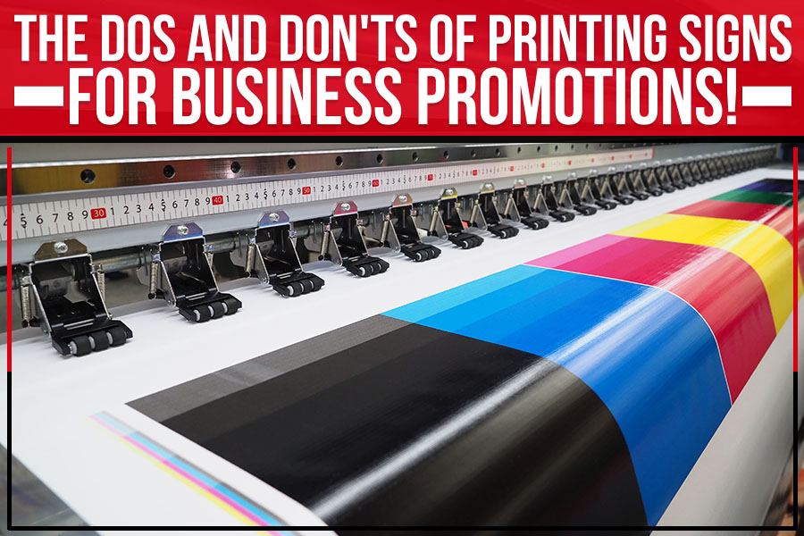
Choose Reliable Printing Companies
Not all printing companies are created equal. When you’re looking for a printer for your signs, choose one with a good reputation and produces high-quality products. Avoid print shops that use low-quality inks or paper, as this will show in the finished product.
Keep it Simple
Complicated designs are harder for readers to understand. Stick to one or two colors, and use clear, easy-to-read fonts. And remember that less is often more – a sign with too much text will confuse people.
The Don’ts of Sign Printing –
Don’t Use Cheesy Fonts!
For fonts, less is more. Choose precise, simple fonts that are easy to read from a distance. Steer clear of anything too fancy or decorative, making your sign look cheap and unprofessional.
Don’t Go Overboard with Color.
While you want your sign to be eye-catching, you don’t want it to be so colorful that it’s difficult to read. A rule of thumb is sticking to one or two primary colors, with maybe a few accent colors thrown in for good measure. And as always, make sure your font color contrasts nicely with your background color.
Don’t Forget the Call to Action.
Your sign should have a purpose: to promote a sale, advertise a new product, or provide directions. Make sure your sign includes a call to action so that people will know what you want them to do after they’ve seen it.
You will just waste your sign space without a clear call to action.
Don’t Use Too Much Ink.
When it comes to printing signs, less is more. Using too much ink will make your sign look messy and unprofessional. Stick to simple designs in one or two colors for the best results.
So, whether you’re looking for a sign to advertise your business, real estate, or political campaign, Big Daddy’s Signs serving Boston, MA, has got you covered. And if you need some help on design & deciding what kind of sign is right for you, our team is more than happy to give you a hand.
Get a quote from our team today!